Web design doesn’t always have to be from scratch. Sometimes an existing site has all the right content, but is badly in need of some TLC where the design is concerned. I recently redesigned and styled a site in just this situation.
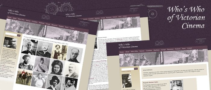
The revamped design for Victorian Cinema

www.victorian-cinema.net was originally set up over seventeen years ago to support the book The Who’s Who of Victorian Cinema by Luke McKernan and Stephen Herbert. In recent years the original template had started to show the strain and the overall design looked rather sparse by modern standards.
The original design of victorian-cinema.net

Apart from the dated design, there were some structural problems with the old template on modern screens. On many pages the content stretched out wildly over any available screen, meaning that on larger or wide screen monitors the page lost all shape.

The brief was to breath new life into the design while keeping the content and layout completely intact. The site its self is over 300 pages and as does not have any form of content management system to change any of the layout would mean changing each page individually – an enormous task. Therefore the plan was to change the site using just CSS to change the styles globally, which would completely revamp the site without the need to re work hundreds of pages one by one.

The new design has a Victorian feel to it, incorporating design elements from the various machines featured on the site, while updating the overall look and feel. The colour scheme makes the site feel warmer and is and more in keeping with the period.
To correct the over running text on larger screens, the site was centred and given a fixed width that allowed users on a variety of different screen sizes and formats to be able to view the site comfortably.
As the site is a information resource it is it essential that the text is clear and pages are easy to find. Therefore the text , spacing and general layout way tided up with careful attention to the line-height, font sizes and style of font. The page headings were indistinguishable from the rest of the text in the original design, but this was helped with use of Cufon to add an attractive font specifically for headings to help them stand out. The links were given a consistent colour and weight to ensure that they were intuitive to follow.
The faded banner image at the top of the site was replaced with a large, colourised image that brings that site together and immediately gives a Victorian flavour to the design.
Finally the site utilises an external search engine which directs uses away from the site and displayed its results on an un-styled page. A custom template was added to style the search results to match the rest of the website so that it would not appear that the user had left the site.
You can read more about this site on the author’s blog:
http://lukemckernan.com/2012/11/28/meet-the-victorians/
